Google’s Universal Analytics (UA) is the most widely used traffic analysis tool in the world — but if you’re reading this article, you probably already know that.
Earlier this year, Google announced that UA will sunset in July 2023, forcing users to switch to Google Analytics 4 (GA4). So, from July 1st, existing UA tracking will stop processing new hits, meaning that you as a marketer will no longer be able to track data on your customers through the old system.
Fall-out for marketers
The potential fall-out from this is obvious for marketers focused on Marketing attribution efforts in order to maximise marketing returns and revenue growth by analysing and pinpointing the most successful marketing channels and campaigns.
Google UA itself had major limitations with sampled data, no integration with offline channels, and blunt attribution methods. Also, somewhat mysteriously, Google-owned media was favoured over other channels in reporting.
The demise of Google UA and the introduction of its G4 replacement should be regarded as a major opportunity and a negligible threat, despite the fact that Google, as you might expect, strongly encourages all users to switch to GA4 before the deadline.
Marketing attribution made worse
GA4 has only made Google’s marketing attribution worse, with deep frustration being expressed by many users trying to set it up, continuing use of data sampling, an historic data disconnect in July 2024, and black box attribution rules.
The fact is, GA4 lacks the functionality to make use of first-party data and does not have the complete range of media and sales channels as standard.
What’s the alternative?
The reality is that, if you ignore the hype around GA4, there are other options that marketers need to be aware of. Indeed, low-cost alternatives are available with full 100% browsing data being collected, through open-source technology, GDPR compliant first-party data and excellent browser dashboards.
At UniFida our customer journey-based marketing attribution is fully integrated with an open-source alternative to GA4. Within our platform we integrate offline channels, such as direct mail and call centres, as well as email service providers and CRM platforms, like Salesforce or HubSpot.
The result? A fully transparent (every score, for every step, in every customer journey is available) marketing attribution solution that can also split results by different customer segments, including new and existing. It reports at a very high level, Return on Marketing Investment (ROMI) by channel by month, and at a micro level performance by individual campaign or UTM.
GA4 is not the only game in town. If you want to ensure total clarity around your marketing attribution, contact us today before time runs out.
UniFida is the trading name of Marketing Planning Services Ltd, a London based technology and data science company set up in 2014. Our overall aim is to help organisations build more customer value at less marketing cost.
Our technology focus has been to develop UniFida. Data science business comes both from existing users of UniFida, and from clients looking to us to solve their more complex data related marketing questions.
Marketing is changing at an explosive speed. Our ambition is to help our clients stay empowered and ahead in this challenging environment.
Below are some frequently asked questions about customer journey-based marketing attribution – and some insightful answers.
What is customer journey-based marketing attribution?
People usually receive or respond to multiple communications on their way to making a purchase. These can be online, such as a Facebook ad, or offline, such as receiving a catalogue. Customer journey-based marketing attribution looks at all the interactions between a customer and an organisation before a sale in order to analyse the role of each interaction, and hence their contribution to the sale.
Which channels are normally included?
We expect to include all ‘direct’ channels, in other words those where there is a one-to-one relationship between the customer and the company, or where there is a direct link through an online user clicking on a digital ad (such as PPC) and visiting the company’s website. An email is direct because it goes to a known recipient, whereas a press ad is not because the recipient is unknown. However indirect channels, such as TV, press, and outdoor, can also be very important. These require a different attribution technique called econometrics.
How do you link the steps in a customer journey?
We start by putting a snippet of code on your website to enable us to download into our attribution platform all of your (first party) website visitors’ browsing activity, including, most importantly, how they arrived at your site. This allows us to distinguish, for instance, between a referral, a branded search or a natural search. We then link the browsing to any offline journey steps by joining them to individuals using identifiers they have provided. To obtain the non-web contact activity we ingest feeds into our Customer Data Platform (CDP) from sources such as your email service provider, direct mail contact history, and your order processing system.
As not all journeys lead to a sale, what do you do with the unsuccessful journeys?
The brutal truth is that for attributing value to marketing activities we ignore them, which is not to say that the unsuccessful journeys are unimportant as they are key when we aredescribing customer journeys overall and understanding the total spend through a particular channel (i.e. we need successful plus unsuccessful spend). But a campaign will only have value attributed to it from the journey steps it created that led to a successful outcome.
How far back in time do you go when looking at customer journeys?
We normally look back 90 days before each sale, although some clients ask us to look at shorter periods, e.g. 30 days. To a large extent it depends on the type of purchase and the channels used. For instance, a catalogue will have a much longer shelf life than an opened email, so we need to give it time to have its effect.
How do you decide on what weight to give to each step in a customer journey?
It is obvious that all journey steps are not of equal importance, so weighting them correctly is crucial to obtaining a successful attribution outcome. There is a great deal of online discussion about this subject, with different approaches being debated, but we have opted for a method which is mainly based on the time intervals before and after each journey step.
If, for example, an event happens just before a sale, we give it a high closing score. In contrast, if there is a long interval after the first event, then we conclude that it could not have had too much of an impact on initiating the sale. We also give credit to events that help keep the customer interested without actually closing the sale. If you would like a more detailed note on how our weightings work, we would be pleased to share this with you.
Are there certain types of event that you ignore?
Yes. Multiple opens of the same email on the same day is one example, as is a visit to PayPal just before closing a sale. We try to eliminate anything that does not contribute to the customer’s decision to purchase.
Can you distinguish the different behaviours of different customer groups when responding to marketing events?
We can. For example, new and existing customers behave entirely differently in terms of the kinds of journeys they make and what marketing events they respond to. Another way we divide up customers is between those who mainly search and buy online and to those who order through a call centre. But you may also wish to look at the impacts of marketing on different types of customer segment, and our platform can support that.
Do you look at how different channels perform at different times of year?
We do, and we find very significant seasonal differences. To show this, we have a specific report providing month-by-month summaries so that we can, for instance, compare email or any other channel’s performance in one month with another.
Do you always look at sales when calculating marketing attribution, or can you look at other goals, such as lead generation?
We often look at non-sale outcomes, and, for instance, recently we have been working for a charity that they wanted us to look at how they get their users to take up different tools that they provide on their website. When looking at non-sales outcomes we lose the value element that we have in a sale, but otherwise the process works in an identical way.
How up-to-date are your reports?
They are always available online at any time and the data behind them is processed each night. So on any day you will be looking at results up to midnight the day before.
Do you aim to answer questions other than the value obtained from customer journeys?
We are finding that this is an increasingly important area, and to respond to our clients’ requests we are building a whole suite of customer journey reports. These will answer questions about the lengths of journeys, the mix of channels used and the sequence in which they appear in the journeys.
Is customer journey-based attribution GDPR compliant?
Yes. It uses only your organisation’s first party data and excludes cookie and analysis opt-outs, for example.
Why not just use Google?
Whether you are using Google Ads or the new or old version of Google Analytics, they have well-documented flaws – namely inaccuracy and incompleteness. Google Ads uses the last Google Ads click, but Google Analytics uses the last click across all channels, so over-reports as it does not take into account other channel’s contributions. Google recognises that this is an issue and has developed Google Analytics 4 (GA4) to
replace the previous version called Universal Analytics – but this will not solve the core flaws. GA4 will use black-box algorithms and again will not take into account all marketing activity. Google is sampled and segments cannot be applied retrospectively for analysis.
Google does not use first-party data or individual identifiers, so it cannot be joined to other data sources of marketing activity.
UniFida is the trading name of Marketing Planning Services Ltd, a London based technology and data science company set up in 2014. Our overall aim is to help organisations build more customer value at less marketing cost.
Our technology focus has been to develop UniFida. Data science business comes both from existing users of UniFida, and from clients looking to us to solve their more complex data related marketing questions.
Marketing is changing at an explosive speed. Our ambition is to help our clients stay empowered and ahead in this challenging environment.
Multi-touch Attribution (MTA) for marketing is all about evaluating the effectiveness of marketing investments by examining their role in generating steps in the customer journey. It was initially developed for ecommerce, but not all MTA is about sales.
In the case of not-for-profit organisations (NFPs), it could be about attributing marketing to successful volunteer sign-ups, or donations. Not all customer journey steps are equal – and for accurate results, it is important to ensure that the approach used includes all the relevant channels, and that calculations can include every event in the journeys towards the target outcomes.
The greater the transparency, the better the insight – and the more opportunities there are to optimise marketing to help achieve NFPs’ marketing goals.
UniFida has been working recently for an NFP, an alcohol awareness charity whose objective is to lead people towards areas of their website that offer support. In this case we have been able to plot their customer journeys leading up to the use of one or other of their tools, and from these evaluate the contribution of their different digital marketing campaigns.
This same approach can be used for evaluating marketing in a number of areas, for example, test drives for cars, university courses, or media content. However under the bonnet, the technology and the analytics remain very much the same.
How does MTA work?
1. Collating online and offline customer journeys
This requires a customer data platform (CDP) or equivalent to bring together, for instance, web browsing actions with email opens, and perhaps phone calls and direct mail sends. Each journey will end with the designated result, but the steps to get there need to be assembled in time sequence.
This requires a 100% data feed from the website (from which we collect first-party data), a feed from an email service provider and a contact history file for the direct mail if needed. The average number of steps in a journey are around three, but the average is deceptive as the steps can range from one up to ten or more. Existing customers also usually take more steps than new ones.
In this example, the journey started on the 12 March and ended with a sale on 1 June. The recipient opened two emails and a catalogue, and undertook two entries to the website (one via PPC and the other going directly).
2. Weighting each step in the customer journey
All steps are not equal and can play different roles. They can help initiate a journey, maintain a customer’s interest and help reach the end result. We use advanced mathematics to undertake the weighting of the steps and this also looks at the role they play. We split the roles into Initialiser, Holder and Closer.
We train the mathematics algorithm to take account of the particular characteristics of the journeys for each individual client, as they can vary considerably. Higher priced items, or choices with more consequences like university courses, will tend to have longer journeys as more consideration is usually required. The algorithms respond to the time periods before and after each step as well as, for a browsing step, the level of engagement with the website.
To continue with the same purchase example above, we have now added in the scores for each step in the journey. The IHC score is the combination of the Initialiser, Holder and Closer scores. Each column adds up to a total of 2, so a 0.4978 IHC score will give that step a quarter of the sale vale. The two emails received some credit for Initialiser, but not as much as they would have done if the sale date had been earlier, whereas the Closer rewards went to the catalogue and PPC.
3. Aggregating the results
Some marketers are interested in puzzling over individual journeys to understand how channels work together for different customers. Others want accurate answers to questions like ‘How did the email test campaign do?’, or ‘Do I get better returns from using Facebook at certain times of the year?’.
To answer these kinds of questions we have to aggregate up the results. If we take an email campaign, for example, it will have contributed to steps in many different customer journeys, some of which will have led to a successful outcome, and usually a much larger number that have not.
We only look at the opened emails within successful journeys and give a value to each of these steps, depending on the value given to the individual outcome, multiplied by the fraction of the overall journey process that the step contributed. So, mathematically, if the outcome is worth £50, and the step has contributed 30% of the journey, then that step is judged to be worth £15.
In this way every step in a successful journey gets a value and these can be summed up to give a value to the overall campaign. This example will help explain how fundamental the weighting approach is to the evaluation of the campaign results – give the step contribution just 10% of the journey and then it’s only worth £5.
Aggregation can provide answers to a number of different questions. It can sum up to an individual campaign, or to a channel, and that is usually for a time period, such as PPC in July. By looking at different time periods for the same channel we can understand the impact of seasonality on response. But we can also turn the data around and look at how different customer groups respond to different types of marketing.
We have already mentioned the differences in behaviour between new and existing customers, but what about, from the charity example above, whether different campaigns lead people to visit different tools in different parts of the website. A car vendor might, for example, be interested to know which media are better at driving test drives for different models.
Here is an example of an aggregated report, taking the channel view for a particular time period. Each channel has a share of the overall value based on the steps it contributed that led up to completed sales. It is interesting to see how the sales impacted are for every channel greater than the share of sales. So, if in this case the marketer decided to stop sending out catalogues, then 26,478 sales would have been impacted and many may not have happened.
4. Avoiding the ‘black box’ classification
There is a natural fear of basing decision making on results created by unknown algorithms that live inside impenetrable black boxes. Happily, this does not need to apply to MTA, as long as the technology can provide a table that shows the values given to every step in every customer journey. With the individual scores visible, the results can be challenged.
We sometimes set up manual scoring systems that give declining weightings to events that are further away in time to the ‘result’. This is a common-sense approach and useful for comparing the outcome with what the algorithms have come up with. For the more mathematically inclined, it is also important to be able to challenge how the algorithms themselves are programmed and to receive back a full explanation.
5. When does MTA not apply?
MTA works when there is a direct link between the person making the customer journey and the steps that take place. So, it is not applicable for TV, or outdoor advertising for instance. For these indirect channels econometrics is the right approach, and the good news is that we can now merge the outputs from the econometrics with the MTA results to provide a truly 360-degree view.
UniFida is the trading name of Marketing Planning Services Ltd, a London based technology and data science company set up in 2014. Our overall aim is to help organisations build more customer value at less marketing cost.
Our technology focus has been to develop UniFida. Data science business comes both from existing users of UniFida, and from clients looking to us to solve their more complex data related marketing questions.
Marketing is changing at an explosive speed. Our ambition is to help our clients stay empowered and ahead in this challenging environment.
It may not come as a complete surprise to be told that your existing customers behave differently from prospects – i.e. people who have never purchased from you before. In fact, the differences are very pronounced, especially when you look at customer journey patterns.
At UniFida we provide technology to help clients capture these customer journeys and then we use AI to analyse them. This enables the true value of different marketing investments to be understood and highlights the journey interactions that are most likely to be successful.
In our study of actual customer journeys, some of the findings are surprising. Possibly the biggest is that existing customers take longer journeys to the point of purchase than prospects. In fact, we found that not only are the journeys longer when measured in days from initial activity to final sale, but so too are the number of sales steps (events) in the journey.
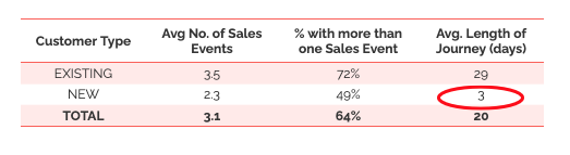
Customer Journeys – New vs. Existing Example
You can see from our analysis that existing customers take on average 29 days, whereas new customers take three days.
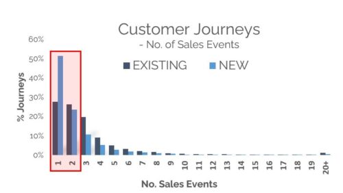
As the chart below shows, many prospects buy within just one or two sales events.
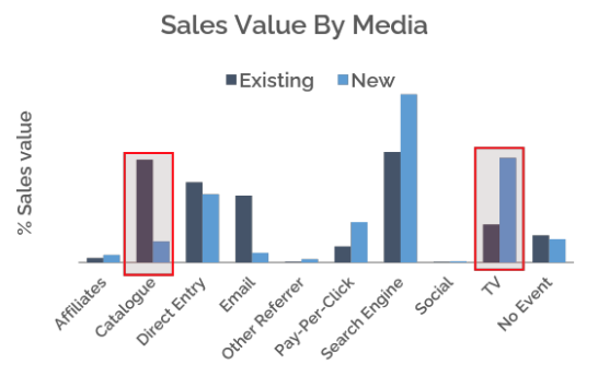
Another key finding is that different channels work better for prospects than for existing customers. Search engines and TV can, for instance, be key for prospects, whereas direct channels like email and catalogues work better for customers.
To some extent this is because catalogue and email are “channels of choice” for customer marketing, and hence drive more sales, but also pay per click (PPC) is used more often by prospects.
Different strategies
Given these facts, it’s clear that very different contact strategies are needed for the two different groups. As existing customers seem to prefer the long haul, the challenge is to keep them sufficiently interested during their journeys. This is where emails and texts come in, particularly when the customer has visited your website and not purchased, and also when you want to discourage them from using PPC by offering click-throughs from an email.
By contrast, prospects are more likely to swoop down on a purchase. They may have started their journey as unrecognised browsers, but when they come back to your website conversion techniques, such as website personalisation, become more important. When prospects are on your website there is no time to be wasted.
Example customer journeys
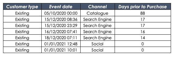
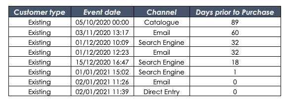
Below are some customer journey examples that illustrate these points. The top two journeys are for existing customers and show the interplay between different channels after a catalogue has been sent to them. We have chosen two particularly long journeys to allow more steps to take place before the purchase.
In the first journey, social media helped close the sale, whilst in the second it was email. Both existing customers used search even though they must have known the name of the company they were looking for, although they may have been looking for alternative suppliers at the same time.
Example: Existing Customer Journey 1
Example: Existing Customer Journey 2
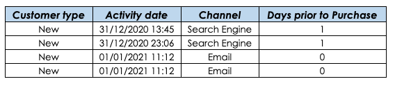
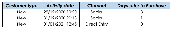
The next two journeys for prospects (new customers) are much shorter. The top one started with the prospect searching and the sale being closed with an email, so he/she must have provided their email address on the website when visiting. In the second case there were two click-throughs from social media followed by a direct entry a day later.
Example: New Customer Journey 1
Example: New Customer Journey 2
What these charts reveal is just some of the complexity, often ignored, surrounding customer journeys and the importance of recording them so that they can be analysed.
By understanding which pathways lead to sales and which don’t, marketers have a far greater chance of making the right moves to convert prospects, and customers, to purchasing.
UniFida is the trading name of Marketing Planning Services Ltd, a London based technology and data science company set up in 2014. Our overall aim is to help organisations build more customer value at less marketing cost.
Our technology focus has been to develop UniFida. Data science business comes both from existing users of UniFida, and from clients looking to us to solve their more complex data related marketing questions.
Marketing is changing at an explosive speed. Our ambition is to help our clients stay empowered and ahead in this challenging environment.
When it comes to measuring marketing success, there’s no doubt that marketing metrics are crucial.
Every company will have its own specific marketing metrics requirements. Analysing what these should be, and then having them delivered in a timely and reliable fashion, is vital for the success of every marketing department – and ultimately the company that it is serving.
To show the value of marketing metrics, let’s compare the fortunes of two different companies. Company A had a good set of accurate marketing metrics and used them well, while Company B had some faulty metrics and decided to be guided by them, with unfortunate consequences.
Company A
This company makes its own products and sells them directly to consumers globally. When the Covid pandemic hit they found that there was a massive upsurge in demand. By the end of 2020 they had sold 2.09 times more than the previous year. By the end of 2021 that had risen to 2.24 times.
However, their top priority was to manage supply and demand to keep the time lag between orders and delivery as tight as possible. This meant managing the amount spent on recruiting new customers and on communicating with existing ones.
Fortunately, they had historic marketing metrics that went back five years. These reported month-on-month sales from existing customers compared to new recruits, and which previous years those customers had come from. Once they knew how much the effects of Covid-19 was uplifting existing customer sales compared to previous periods, they could accurately forecast demand from existing customers for the rest of the year. This gave them a clear indication of the level of new recruits required to fill the factory capacity.
The net result? They were able to fill the factory whilst minimising their marketing spend and achieve a very strong ROMI (return on marketing investment).
Company B
This company also manages their own production, but they had a faulty metric. This was the sales value they were getting from customers to whom they had sent a catalogue. There were two reasons for this:
the lack of can accurate single customer view, which led to multiple duplicate records, and
an inaccurate match-back of those mailed to people ordering.
The result was that their metrics were reporting a much lower return – in fact, one-third of what it should have been on catalogue campaigns.
This led to a decision being made to abandon catalogues in favour of email communications. However, the company had not been particularly successful at collecting email addresses, and as a result there were only 14% of active customers for whom they had email addresses and who had not opted out.
Despite a very high volume of emails being despatched, the overall order rate in each year, from existing customers began to decline. Over a five-year period, it had sunk to a half of what it had been at the start.
However, because they were successfully recruiting new customers, the actual order value from existing customers kept going up, so nothing was noticed. In other words, instead of using the right metric – i.e. what proportion of the customers you start the year with go on to order in that year – they used the wrong metric, which was simply the absolute number of existing customer orders.
The net result was that Company B lost several million pounds worth of potential sales from existing customers, whilst not even understanding that this opportunity had been missed.
So, the value of accurate marketing metrics is clear. Analysis of those metrics is crucial to the success of your marketing activities – and your bottom line.
UniFida is the trading name of Marketing Planning Services Ltd, a London based technology and data science company set up in 2014. Our overall aim is to help organisations build more customer value at less marketing cost.
Our technology focus has been to develop UniFida. Data science business comes both from existing users of UniFida, and from clients looking to us to solve their more complex data related marketing questions.
Marketing is changing at an explosive speed. Our ambition is to help our clients stay empowered and ahead in this challenging environment.
Many companies selling online to consumers experienced a Covid-19 “customer bump” – i.e. a hike in sales during the pandemic. For most of these companies, these peak sales will have dropped back to a “new normal”.
The question is: how should marketers respond in a post-Covid scenario?
First, below are some examples of customer figures based on UniFida’s clients:
Both clients experienced a massive upswing in new customers recruited in 2020, followed by a reduction in 2021. These indexed customer recruitment figures are calculated by taking 2019 as the base.
However, neither client had an upswing in the % of existing customers reordering:
So, for both clients a slightly smaller proportion of existing customers reordered during the Covid period compared to 2019.
The implication therefore is that the Covid bump came from newly recruited customers rather than existing ones. However, it has to be said that both the level of new and existing customers ordering, are driven by many factors other than Covid, including marketing expenditure.
So, what to do about the Covid era recruits?
First, it’s important to put in place a month-by-month monitoring system for this cohort to track exactly how strongly they are reordering, and whether they are ordering the same merchandise mix as the non-Covid recruits.
If they are reordering less strongly, they need somehow to be re-engaged. And if they are ordering differently, this gives a clue as to what to offer to this group.
Second, consider asking for a demographic profile to compare pre-Covid with in-Covid recruits. We did this for one of our clients and the shift between the 2019 cohort’s demographics and the 2020 was quite substantial:
So, the 2020 new customers are substantially younger than those recruited in 2019, but come from the same income bracket.
It’s important to take a look at how the Covid recruits found you and ordered from you. Their pre-order customer journey may have been different to the pre-Covids – they may have been more likely to find you from social media, or responded to Google Adwords. Whichever route they took will give you a strong clue as to how best to reach them, and others like them, in future.
Armed with information about the Covid bump’s demographics, merchandise choices and channel preferences – and assuming that they are different to the pre-Covid recruits – it will be worth treating them as a separate segment for some time going forward.
Impact on behaviour
Covid had a massive impact on people’s behaviour and, depending on the types of merchandise you are selling, you may wish to try to reincarnate the marketing conditions that drove new customers to you during that period.
This COVID bump will certainly have changed the customer base and marketing metrics. What worked in the past will not necessarily apply to these new cohorts. However, gaining better insights into this group, and testing tailored communications across channels, can turn core segments of this blip from one-off lockdown buys into high-value and loyal customers.
UniFida is the trading name of Marketing Planning Services Ltd, a London based technology and data science company set up in 2014. Our overall aim is to help organisations build more customer value at less marketing cost.
Our technology focus has been to develop UniFida. Data science business comes both from existing users of UniFida, and from clients looking to us to solve their more complex data related marketing questions.
Marketing is changing at an explosive speed. Our ambition is to help our clients stay empowered and ahead in this challenging environment.
In an increasingly customer-centric world, the ability to access and gain valuable customer insights to shape products, solutions and the customer purchasing experience as a whole is critically important. For that reason alone, customer data must be seen as strategic.
For example, by pulling together rich customer profiles and rigorously tracking response rates, marketers can know precisely what types of content and over what channel are likely to have the greatest impact on the bottom line.
To achieve that, the Customer Data Platform (CDP) can not only be a key enabler, but also a marketer’s central knowledge store.
Historic view of customer value
As a CDP builds a single customer view, it also accumulates an historic view of all the visible customer interactions with the company, both online and offline. Over time these accumulate into an invaluable and extraordinarily rich data ‘reservoir’.
The ability to ‘fish’ in this reservoir via a CDP enables marketers to address some fundamentals, including:
how much revenue is coming from existing customers, as opposed to new ones
how much value last year’s recruits provide, compared with those from earlier periods
dividing customers into cohorts defined by time periods or specific recruitment campaigns
establishing the longer term value they bring to the company
In terms of sales, the data reservoir enables you to track the overall monthly trendline from year to year, and dig deeper into the areas that are showing the most potential. You can see if individual customers are spending more or less overall, or spending on particular product categories and, by using history to establish what the seasonal effects are, you can examine the underlying growth trends.
Impact of marketing
The CDP is also a valuable asset when it comes to looking at the true impact of your marketing campaigns on customers. It can help you answer key questions, including:
what is the ROI for each channel for each time period?
how are different groups of customers responding to individual campaigns and which ones are keeping their appeal?
is the pattern of customer journeys changing?
are customers putting more steps in the pathway and spending more time considering their purchase?
are customers increasingly taking their own route to purchase and being less influenced by the campaigns you are sending them?
are customers browsing for longer periods, or dropping more baskets
is this the same across all customer groups?
Segmentation and propensity models
You can also use the data reservoir to build customer segmentations and propensity models – for example, the experience of some customers considered dormant to reactivate will provide the target variable for a reactivation model. Similarly, customer attrition can provide the target variable for an attrition risk model.
The algorithms derived from these models can then be reapplied within the CDP to score individual customers for retention or reactivation campaigns, or to predict next best actions.
So how best to access the reservoir and gain valuable customer insights?
How easy is it to access all this knowledge? Well, there are a number of different approaches that can be taken./ You can:
use data visualisation tools like Microsoft Power BI or Tableau to provide a continuous dashboard of customer performance, with tables bespoked to your specific KPIs
take a copy of the entire data reservoir and use data science tools like R or Python to answer specific questions and to develop predictive models and segmentations
use out of the box capabilities for reporting metrics that have been developed inside your CDP.
Packaged solutions
Here at UniFida we have pre-packaged a large number of customer and marketing metrics within our CDP. For example, we provide multi-channel order attribution that allocates the value of each order back across the steps in the customer journey that led up to it. This means that we can report on the precise value contributed by each channel and each campaign, for any time period and across any segment of customers.
In summary, a key role of a CDP is to build a data reservoir over time to provide an invaluable and irreplaceable source of information about customer behaviour and marketing effectiveness. The reservoir should fill up naturally, and the marketer’s role is to ask the right questions and have the tools either built into the CDP, or applied externally, to obtain the answers.
UniFida is the trading name of Marketing Planning Services Ltd, a London based technology and data science company set up in 2014. Our overall aim is to help organisations build more customer value at less marketing cost.
Our technology focus has been to develop UniFida. Data science business comes both from existing users of UniFida, and from clients looking to us to solve their more complex data related marketing questions.
Marketing is changing at an explosive speed. Our ambition is to help our clients stay empowered and ahead in this challenging environment.
Customer journey analytics can tell us some of what we need to know about the routes customers take, but does it help us to improve conversions?
What is customer journey analytics?
Customer journey analytics is the science of analysing customer behaviour data across multiple touchpoints, and over time, to measure the impact of customer journeys on business outcomes.
Companies use customer journey analytics because it is an effective way to improve customer experience, increase customer lifetime value, and improve customer loyalty.
Let’s start then with what we mean by the ‘journey’.
This can be used to describe a myriad of different routes from just travelling around inside a brand’s website, to trekking between websites and mobile applications, to flipping between online and offline channels, or to contacting a call centre.
Indirect channels like TV and press may also play a part, and, least trackable of all, conversations actually take place between people.
So, let’s dispense with one myth, that customer journeys are always trackable, as some of them are not at all, and others only partially. For instance, only a tiny proportion of retailers attempt to collect emails or other contact details from customers in their stores, and, when they do, many refuse. Some retailers use ‘beacon’ technology to understand if the customer is a repeat visitor or new; however, matching this back to the customer has raised some privacy concerns.
The extent to which we can join together the stages in the journey is entirely dependent on the evidence by way of personal identifiers that the visitor leaves behind at each stage, and how they can be linked.
For instance:
Email marketing identifies which customers have opened and/or clicked from each campaign. Direct mail provides the details of who has been sent a catalogue, however not if they received it, or even browsed it.
Call centre tracking identifies the number you are calling from.
Website analytics captures the cookie ID of website visitors, how they got to the site, and whether that was through search, direct visit or referral from another online channel like social or paid digital.
Tracking is one thing, but then linking events together is another. To do so one needs to form associations between personal identifiers. A cookie ID becomes much more valuable when linked to an email or a mobile number. An email is more valuable when it is associated with a postal name and address, and so on.
All customer journey analytics relies on being able to link stages in the journey using identifiers that can be matched up. The most obvious case where external links don’t exist are unidentified browsers, where one browsing visit can be linked to another, but not to anything that is going on in the offline world, or in other websites.
We must accept that customer journey analysis can only deliver a partial truth, but this is not to deny that a great deal of value can still be obtained from it.
Visualising customer journeys using analytics
We can depict these customer journeys using what is known as a Sankey diagram, named after Captain Matthew Sankey.
Sankey customer journey diagram
Alternatively, with a numerical version of a Sankey diagram, like the one below, we can start to understand what the probability is of customers moving onto another stage in the journey, or making a purchase.
Numerical version of a Sankey diagram
To understand this chart, start with a channel on the left and read across to find the probability of moving from that point to the next channel (column), or to making a purchase (described as conversion), or to nothing further being trackable on the customer journey (described as null).
Improving conversion rates
So, what can be done with the information in a chart like this?
It brings a sense of reality. If you know that the probability of moving from social media to a sale on your website is five per thousand, you will take a more sober view of media owners’ claims.
It provides a really useful comparative understanding of the impact of different channels. In this example the chances of purchasing after receiving and opening a series of four emails (described as campaigns) is 6%, whilst after four direct entries it’s 5%.
It explains the benefit to be gained from multiple experiences in the same channel. The chances of purchasing after a fourth consecutive search is 2.4 times greater than a conversion following a single search.
It shows where the interactions between channels are more likely to happen. For instance, the chances of moving from receiving a fourth email campaign to undertaking a direct search are 12%, compared to 5% after receiving just one.
It also shows us which are the better channels from which to start the journey. In this case starting with an email campaign opening is best.
These are just examples of some of the uses of visualising a customer journey, and you will want not just one but multiple views. For instance, new customers will have very different journeys to returning ones, and so will people from different countries, or those buying expensive merchandise compared to those buying something cheaper.
Most organisations struggle to understand their impact on customer experience, and the value which can be generated from enhancing it, due to several reasons:
The number of customer touchpoints and the volume of data produced by multiple channels and devices has exploded in recent years. Having this in one place becomes a challenge.
Data silos lead to problems of data mismatches, missing and bad data and, time to transform and aggregate the data.
Shortage of skills and resources to analyse and make sense of the data, as it often requires skilled data scientists and analysts who are conversant with programming languages like Python, R or SQL.
Inability to attain rapid customer insights, and execute triggered activity across multiple channels, can have negative consequences if you’re not aware of each customer’s experience with your company across channels.
Now, your customers expect every interaction with your organisation to reflect the context of their entire experience regardless of which touchpoint they use next. So how do you meet these expectations?
Overcoming these obstacles and making journey-driven decisions for each customer at scale
You are probably now in need of an explanation of how you can start to understand your customer journeys, visualise the data, and make use of it?
We recommend first introducing, if you don’t already have one, a customer data platform into which the data describing different parts of the journey can be ingested, and linked together wherever identifiers can be matched. A typical customer data platform will take in data from your email service provider, your website, your transactional or ecommerce systems, paid digital and possibly your call centre and your retail outlets. Your objective will be to ingest as many parts of the customer journey as possible.
The customer data platform will then undertake what is known as identity resolution to join as much data to individuals as is possible.
(Incidentally the customer data platform will have multiple other uses than customer journey analytics, although this remains a key element of what it can deliver).
With this in place, you have the potential to build a table of all the visible and linkable events that precede each transaction. As long as these are date-stamped, technology can then provide you with the journey charts that you will require to help plan your direct marketing.
Most companies lack the comprehensive, up-to-date journey data needed to optimise each interaction, so they are forced to run experiments on single channels, such as email or website, without understanding their wider impact. By having a single view, real-time data visualisation and the ability to trigger activity based on events, you can see how customers respond to each improvement as your customers experience them.
We have developed this capability inside the UniFida customer data platform, so that for any time period, and any segment of customers, the production of this kind of analysis is automated.
Considering investing in a customer data platform? Contact us to get started with one of our complimentary CDP services.
UniFida is the trading name of Marketing Planning Services Ltd, a London based technology and data science company set up in 2014. Our overall aim is to help organisations build more customer value at less marketing cost.
Our technology focus has been to develop UniFida. Our data science business comes both from existing users of UniFida, and from clients looking to us to solve their more complex data related marketing questions.
Marketing is changing at an explosive speed, and our ambition is to help our clients stay empowered and ahead in this challenging environment.
The origins of multi-touch attribution (MTA) were in the digital space, as a result of advertising spend transitioning away from traditional “offline ads” to digital media and channels which were deemed to be more accountable. Journeys within a client’s website, or between websites, could be stitched together and the resulting orders joined back to customers and their orders.
Now that the removal of third-party cookies is going to remove much of the stitching between websites, unless you are working with a collaborative data solution that allows this to take place, you are left just with customer journeys within your own website in full view.
These journeys may however include affiliates, referrers, digital ad campaigns, PPC, and direct search so you will at least know where the visitors came from if not the ad impressions they had been served to get them there.
However, we believe that there is still a great deal of merit in MTA, but not when it is restricted just to online events. (There is also the huge consideration that some of the large analytics platforms use sampled data and not 100% raw data which means the more you dig, the less you see).
Estimates vary about how much of advertising spend is digital, but the consensus appears to be around 55% currently, and that leaves 45% non-digital which is clearly far too much to ignore, much as Google would like us to. We also suspect that with the removal of some of the programmatic advertising volume, the digital proportion is likely to reduce down, perhaps to around 50%.
There is absolutely no reason why MTA should ignore the non-digital channels; but it means that you require the technology to joint it all together at a customer and order level. This is most effectively achieved using a customer data platform which is specifically designed to join browsing activity with off-line into a single customer view.
The non-digital ‘touches’, we prefer to call them ‘events’, can for instance include emails opened, text messages, call centre contacts, retail visits, and direct mail. These are all direct events, but on top of these are non-direct advertisements such as TV, which we discuss below.
There is a lot of unscientific opinionizing about the best approach to weighting events before an order. We are confident that we have found a reasonably good statistical solution for this. It uses a mix of Markov chains and survival curve statistics to give the weightings to any specific set of events. This approach does not presume anything about first or last touch, but rather looks at the evidence presented when the events have all been joined together in a single customer view, together with your customer and order data.
To deal with the non-direct channels like TV, the more ambitious will also want to build econometric models which reveal the overall effect on demand of all channels, direct and indirect, when working in combination. Econometric models often get a bad press as being unresponsive to short term changes in consumer behaviour, and not being granular enough in their spending recommendations, but they are the best tool we have to give the non-direct media their fair share of the credit for sales made.
Techniques now exist to align econometric models with multi-touch attribution so that, in effect, value initially credited to direct channels can be reattributed back to the indirect channels; this usually has a significant influence on the overall share of demand given to the direct channels.
So, to present what we have been describing diagrammatically, a full attribution process is going to look like this:
One of the often overlooked, and we believe very significant benefits of MTA, when it is sitting on a single customer view, is that it can be cut by customer type. The simplest cut is to distinguish between what is bringing new customers versus existing. But the cut can be for any customer segment, like high value versus low value customers, or purchasers of particular types of merchandise.
Multi-touch attribution can tell you a lot about how your marketing works, but only when you look at all of your online and offline channels in combination. And for many advertisers using indirect channels like TV, then it becomes important when possible to align MTA with econometrics.
In so far as we only look at events prior to a sale we will learn nothing about what doesn’t generate a positive outcome; however, if we take a look at all browsing events, we can start to examine the probability of an event leading, or not leading, to a sale.
There are two reasons why this is valuable information, although unfortunately often ignored. First, because knowing the probability of say a Facebook advert leading to a sale brings a sense of realism about advertising there, but also because serving people adverts in which they are not interested does damage to your brand.
Back in the heyday of direct mail, people were so fed up with the quantities that kept on arriving that they called it junk mail, and often had stickers on their post boxes asking for it not to be delivered. (Unfortunately, the postman had no choice but to pop it in their box).
Common sense suggests that this must be way over the top of what is either necessary or enjoyable, and people will increasingly assert their objections to it.
Clearly brands that focus on the relevance of their advertisements will create a much more favourable impression than those that just focus on volume.
We have started to investigate browsing behaviour in terms of its likelihood to lead to a sale, with the following result:
Probability of browser moving to and from events and a sale
To explain how this table works (and it was built using actual online and offline event data) it shows the probability of a person moving either from one event channel to another, or to a sale. So, if you start with picking a channel on the Y or vertical axis, you can then move along the row to view the probability of a customer moving to the next browsing state. For instance, someone coming to your website from a social network has a 96% probability of doing nothing further, and a 0.55% probability of being converted to a sale without engaging with additional channels. They also have a 0.67% chance of moving next to a search engine, whence they will have a 3.3% probability of making a purchase. However, someone receiving a campaign has a 6.5% probability of conversion without using other channels, and a 6.7% probability of moving next to a search engine.
So, in conclusion, we suggest that there is a strong role for multi-touch attribution, post third party cookies, with or without econometrics, and another new role for data science in investigating what we might call dark advertising, the stuff you see, but which makes little or a negative impression.
UniFida is the trading name of Marketing Planning Services Ltd, a London based technology and data science company set up in 2014. Our overall aim is to help organisations build more customer value at less marketing cost.
Our technology focus has been to develop UniFida. Data science business comes both from existing users of UniFida, and from clients looking to us to solve their more complex data related marketing questions.
Marketing is changing at an explosive speed. Our ambition is to help our clients stay empowered and ahead in this challenging environment.
We are asking the question because we expect the key currency of the new post-COVID economy will be trust, and trust in data.
Imagine you are amid your biggest campaign of the year, you are explaining the results to your leadership team, and are faced with questions like “how do you know”, “is the data right” or “why didn’t that campaign reach all of our intended audience”? I’m sure you have been in these types of scenario, which happen every day in the life of a marketer.
77% of IT decision makers do not completely trust the data in their organisation for accurate, timely, business-critical decision making.
76% of IT decision makers report that revenue opportunities have been missed due to a lack of data insights.
83% find data is not available at the time it is needed
53% of mid-size companies suffer from too many disconnected data sources.
So, we would like to focus attention on some of the key data and insight issues faced by mid-size B-to-C companies in the UK and make suggestions around how they can be resolved.
Our experience is that these problems often have three separate causes:
Customer data availability and quality
Availability of skilled data analysts equipped with the right analytical tools
A failure by the decision makers to frame the right questions for the analyst
Customer data availability and quality
The SnapLogic report reveals that 53% of mid-size companies have too many disconnected data sources, while 40% have poor integration of data sources meaning that data is missing or incomplete.
A typical B-to-C marketing department will often be looking at a distributed data situation with multiple silos like this:
Distributed data flow with multiple silos
The problem with this configuration is that there is no place for maintaining the overall customer picture, just pieces of the jigsaw in different places. So, it would be well-nigh impossible to answer questions like:
where am I acquiring my higher value customers from?
how is my latest email or catalogue campaign performing when most orders are placed without source codes via the website?
how do I know which of my dormant customers are worth trying to reactivate?
how many of my orders are coming from customers recruited this year, last year, and the years before?
how do I understand the ROI I am getting from each acquisition channel?
… and many more.
One solution to the data availability and quality problem is to introduce a customer data platform (CDP) that ingests data from all available online and offline sources and builds a single customer view. Marketers are increasingly focusing on first-party data to drive better customer experiences and marketing outcomes. More than half of marketers surveyed by Winterberry Group say cross-channel audience identification and matching is their highest priority. In fact, investment for identity resolution is projected to reach $2.6B in 2022, according to Forrester Consulting. So, it is no surprise that brands are taking this seriously and most want to create a single customer view.
A major part of what a CDP does is to undertake identity resolution; the process whereby data arriving from different sources is matched together using a range of different personal identifiers such as email, mobile, postal, cookie ID, customer number. The key consideration here is that the CDP needs to maintain for each customer a table of all known personal identifiers so that when a new one is introduced it can where possible be matched in.
The CDP then provides the single central source of truth about customer behaviour from which dashboards can run and analytics can be undertaken; it will also be used for activating multi-channel customer campaigns and for resolving GDPR questions.
Availability of skilled data analysts equipped with the right analytical tools
A large organisation like a bank will have upwards of 50 skilled data analysts, but with many smaller organisations it is often the case that they have one or none and rely on external resources to support them.
There are several reasons for this. Cost is a key factor and linked to that, the difficulty of putting a precise number on the value that a good data analyst can bring. Next the demand for analysis normally fluctuates, and a single analyst would always be facing feast or famine. Also, data analysts usually prefer to work in small teams so that they can discuss problems and learn off each other. Being the only data analyst in an organisation is a lonely position, and often they end up just cranking out reports and become dispirited.
A lot of the reporting can be resolved by introducing dashboarding technology like Tableau or Microsoft Power BI, but these tools still need to be configured to produce the right information.
However, dashboards and data visualisation tools can only take you so far. If you need some more complex analysis, or if for instance you want a propensity model to predict the next best offer to make to each of your customers, then a data analyst becomes essential.
To undertake more complex analysis the analyst will need good tools like SAS, SPSS, or R.
For the smaller organisations, the right solution could then be to outsource to an analysis company or to independent contractors, until demand has grown to a scale where the function can be brought inhouse.
A failure by the decision makers to frame the right questions for the analyst to answer
This issue is less frequently discussed but, in our opinion, not one to be brushed under the carpet.
A considerable amount of the work done by data analysts is wasted because someone does not spend sufficient time thinking about what the real problem is that the analyst should be trying to answer.
Einstein said…
“invention is not the product of logical thought, even though the final product is tied to a logical structure”.
Unravelling this statement in the context of customer marketing, we would suggest that the person who requests the analysis will succeed if they allow their imagination to fire up a range of conjectures that the logical analyst can then set about proving or disproving.
Some analysis is more mundane, but when for instance a business is contemplating several alternative strategic changes then the analyst should look at all the different scenarios that these would potentially deliver, and, as far as possible, provide the business with an understanding of their relative merits.
So, in conclusion…
From our experience it is fair to say that a large proportion, probably more than 50%, of medium size organisations involved in B-to-C marketing that we encounter have their customer data disconnected and spread across multiple systems. This is a problem that can be solved, and the costs are not frightening. A CDP will usually cost no more than 0.5% to 0.75% of sales.
However, setting up from scratch an internal insight and analytics department is challenging, and outsourcing will make economic sense until demand has grown. Also, the outsourced provider should have analysts with a very wide range of experience and skills.
And then how to ask the right questions of the analyst? We would recommend giving the analysts scope to try out different approaches, and to look at different angles to a question. Like this they are far more likely to land on an interesting and valuable solution.
[1] Data Distrust Report – the impact of data distrust on analytics projects and decision making published by SnapLogic in 2020, based on interviews with 300 US and 200 UK IT decision makers.
UniFida is the trading name of Marketing Planning Services Ltd, a London based technology and data science company set up in 2014. Our overall aim is to help organisations build more customer value at less marketing cost.
Our technology focus has been to develop UniFida. Data science business comes both from existing users of UniFida, and from clients looking to us to solve their more complex data related marketing questions.
Marketing is changing at an explosive speed. Our ambition is to help our clients stay empowered and ahead in this challenging environment.
We use cookies on our website to give you the most relevant experience by remembering your preferences and repeat visits. By clicking “Accept”, you consent to the use of ALL the cookies.
This website uses cookies to improve your experience while you navigate through the website. Out of these, the cookies that are categorized as necessary are stored on your browser as they are essential for the working of basic functionalities of the website. We also use first-party cookies that help us analyse and understand how you use this website so that we can improve our navigation and content. These cookies will be stored in your browser only with your consent. You also have the option to opt-out of these cookies. But opting out of some of these cookies may affect your browsing experience.
Necessary cookies are absolutely essential for the website to function properly. This category only includes cookies that ensures basic functionalities and security features of the website. These cookies do not store any personal information.
Any cookies that may not be particularly necessary for the website to function and is used specifically to collect data to help us analyse and understand how website visitors use our website to improve our navigation and content are termed as non-necessary cookies. It is mandatory to procure user consent prior to running these cookies on your website.